Mizuho Americas / 2020
A shared identity
Room for everyone
A cohesive identity system for Mizuho’s employee networks—designed to express individual communities while strengthening their connection to the parent brand.
- My role
- Executive Director, Brand Management, Creative Services & UX/UI
- Scope
- Brand strategy / Identity / Guidelines / Applications
- Recognition
- GD:USA 2020Branding + Identity
The challenge
Find the
essential idea
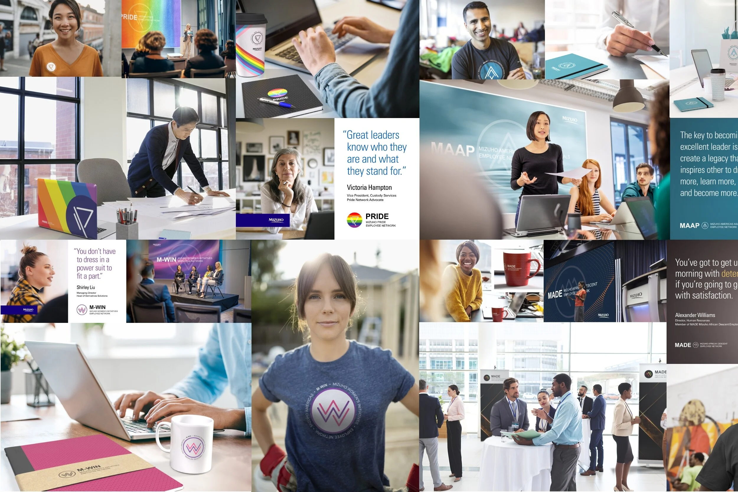
Mizuho’s employee resource groups had inconsistent visual identities. The opportunity was to give each community a recognizable voice within a coherent family of marks, rather than treating every group as an isolated design problem.
My approach
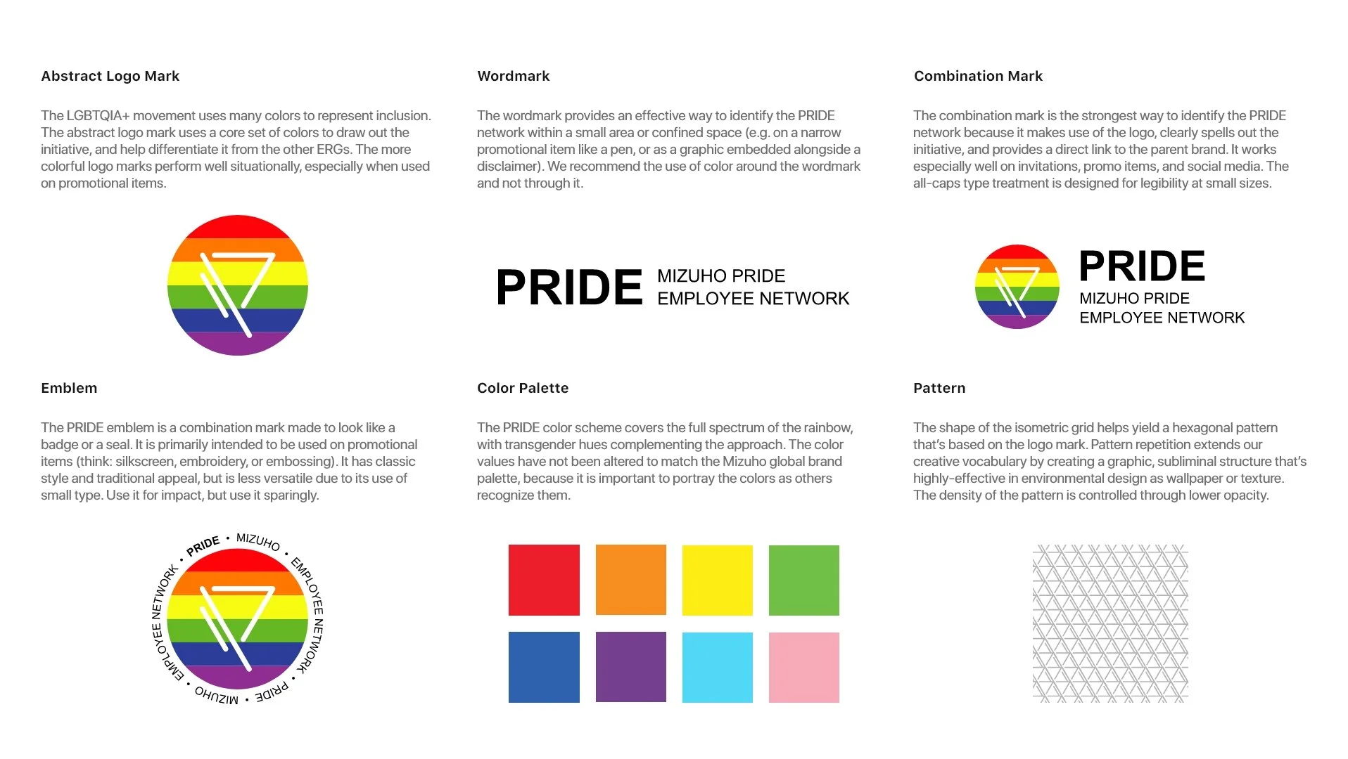
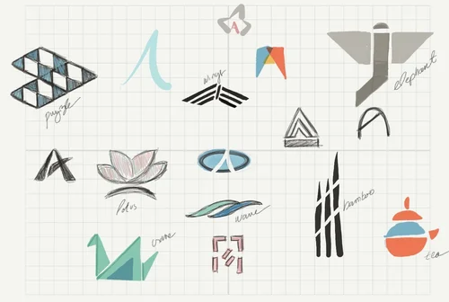
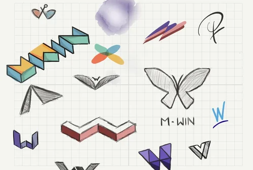
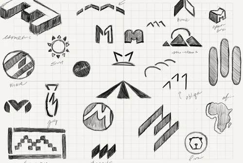
I built a common design language around a uniform grid, naming hierarchy, typography, and color. Each identity used a distinct letterform and visual metaphor, with three lines connecting the marks to Mizuho’s origins as three banks. The system was designed to flex across language, events, social media, and physical applications.
The result
The work received the 2020 GD:USA American Inhouse Design Award for Branding + Identity. Its strength is the relationship between the parts: distinct identities that still read as one family.