joe santa✳
← Selected work

Healthfirst / Enterprise design language

Brand principles
Put into practice

Core Styles translates Healthfirst’s visual principles into a shared typographic and structural system—giving designers practical rules and tools for consistent, adaptable work.

My role
Director, Creative ServicesSystem architecture / Hands-on design / Documentation
Scope
Typography / Modular grids / Style packs / Multilingual handling / InDesign automation
Impact
20% faster turnaroundGo-to-market production
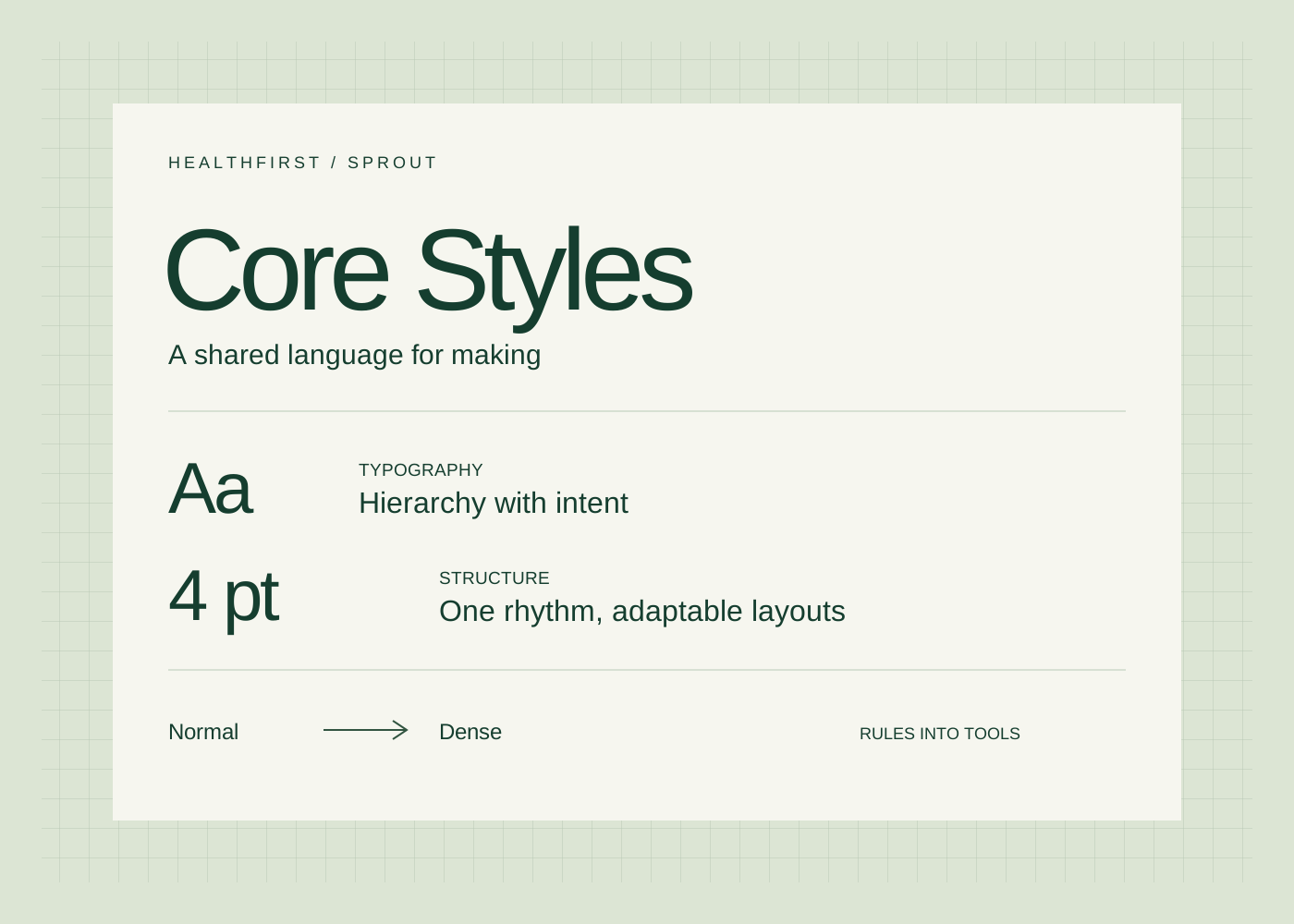
Core Styles: hierarchy, a four-point rhythm, and adaptable Normal and Dense layouts

The design challenge

Give teams a
shared method

A brand’s standards have to hold up in everyday production: a short flyer, a dense benefits document, a table, or a translated communication. The system needed a common logic that could absorb those differences.

From brand intent to design decisions

I built Sprout as Healthfirst’s enterprise design language, connecting typography, color, spacing, imagery, and hierarchy. Core Styles is its typographic and structural foundation: named styles, modular grids, and coordinated layout packs that turn those principles into working tools.

A system with room to adapt

The documentation defines how designers can change content density, accommodate multilingual copy, and preserve a consistent hierarchy. The same underlying relationships support different formats and production needs.
System architecture

A clear relationship
from intent to execution

Brand guidelines establish identity.
Sprout defines its application.

  1. 01 / Brand principles

    Healthfirst

    Identity, visual intent, and tone

  2. 02 / Design language

    Sprout

    Shared foundations, components, patterns, voice, and governance

  3. 03 / Working foundation

    Core Styles

    Typography, spacing, grids, named styles, and production logic

Implementation began in print. The broader Sprout framework sets a direction for shared digital tokens, responsive components, and governance workflows.

Explore the logic

Change the density
Keep the hierarchy

An interactive illustration
using sample copy.

A shared design language

Clarity carries
the message

Good information needs a clear structure. A consistent typographic hierarchy helps people find the main idea, understand the detail, and recognize what comes next.

Adapt the layout to the content

Core Styles coordinates type, spacing, and grids so that a compact layout can share the same visual language as a more open one.

  • Preserve the reading hierarchy
  • Keep body type and leading consistent
  • Adjust paragraph spacing through a defined style pack

Illustrative sample content, not a Healthfirst communication.

12 pt Body type16 pt Leading12 pt Paragraph spacing4 pt Baseline unit

The documented Normal and Dense packs share semantic style names. This interactive interpretation uses sample copy and a web typeface to demonstrate the body size, leading, and spacing rules.

What I defined

Rules that travel
with the work

01

A semantic style vocabulary

Paragraph and character styles encode hierarchy and inline behavior. Logical and decorative heading variants give designers control over what belongs in a table of contents while preserving the visual hierarchy.

02

Adaptation within clear limits

A four-point baseline and defined column grids create a consistent rhythm. Normal and Dense packs adjust spacing to fit different content volumes. The documentation sets a sequence for handling translated copy before escalating to content or format changes.

03

Multilingual typography

A shared numeric weight vocabulary maps across Latin and Chinese type families and icon sets. Character rules handle mixed-script text, while no-break and superscript controls address recurring production details.

04

Design logic inside the tools

Named paragraph, character, table, cell, and object styles work with GREP rules and supporting scripts in InDesign. The documentation includes version changes and known limitations, making the system inspectable and easier to maintain.

From the working documentation

The decisions
behind the consistency

Selected excerpts from
Core Styles v2.10.

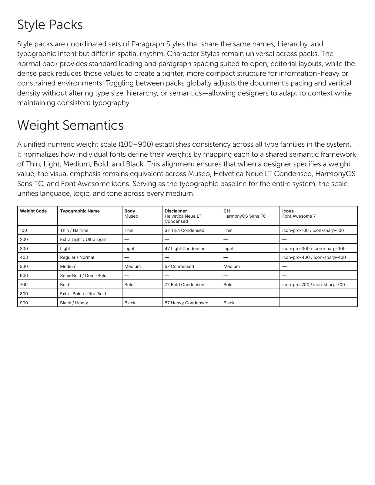
Core Styles documentation defining Normal and Dense style packs and a shared numeric weight vocabulary
Style packs and weight semantics: consistent meaning across different layout densities and type families.
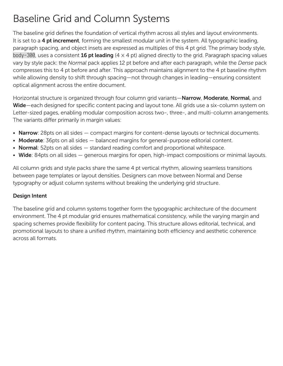
Core Styles documentation defining the four-point baseline and modular column grids
Baseline and column systems: a common rhythm with defined options for content density and format.
Read the foundation excerpt

What changed

A working language
for a creative team

20%

Faster turnaround during go-to-market

Core Styles gives the team a shared method for evaluating content and applying the design language. Its value is in the relationship between creative judgment and repeatable execution: designers have a clear starting point, defined ways to adapt, and practical tools for maintaining consistency.

Next projectMizuho employee identities