ERG Branding and Identity

2020 Winner — Graphic Design USA — American In-House Design Award for Branding + Identity Programs
Introduction
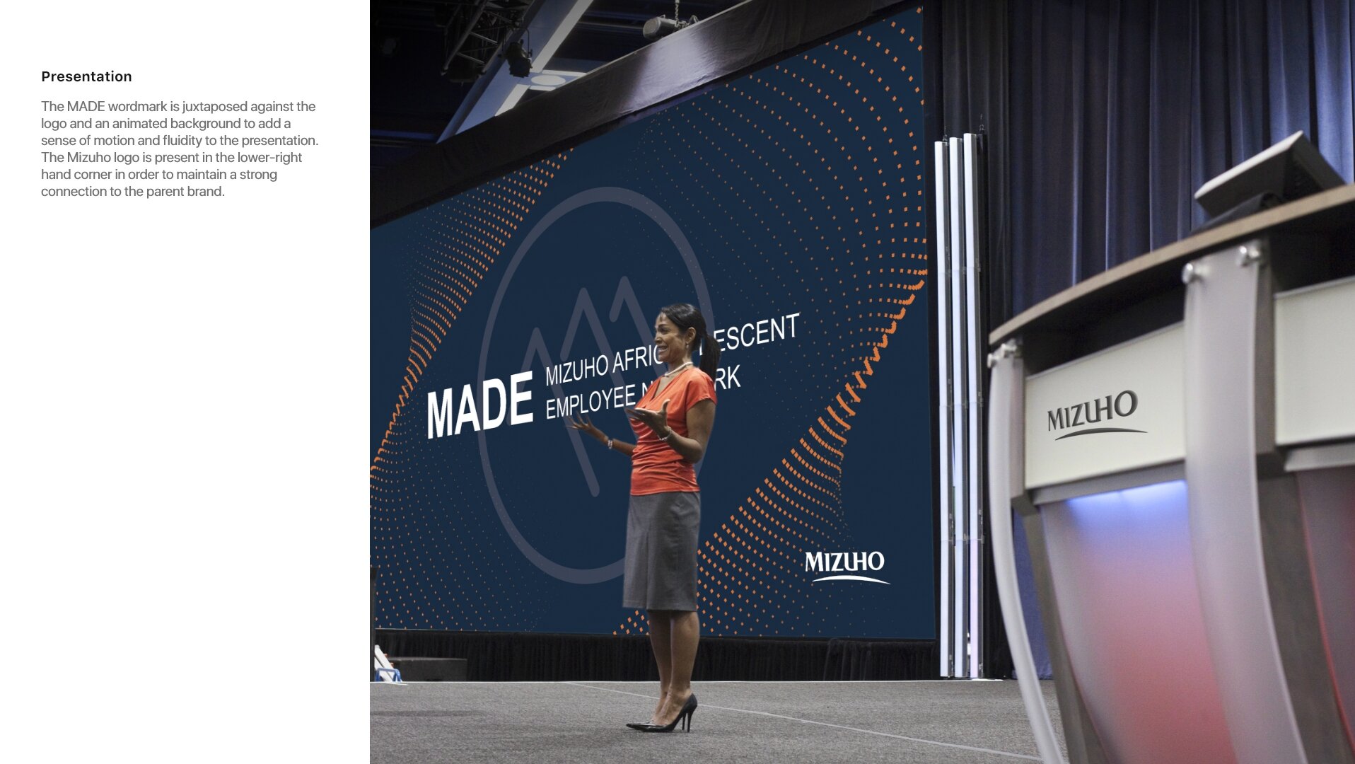
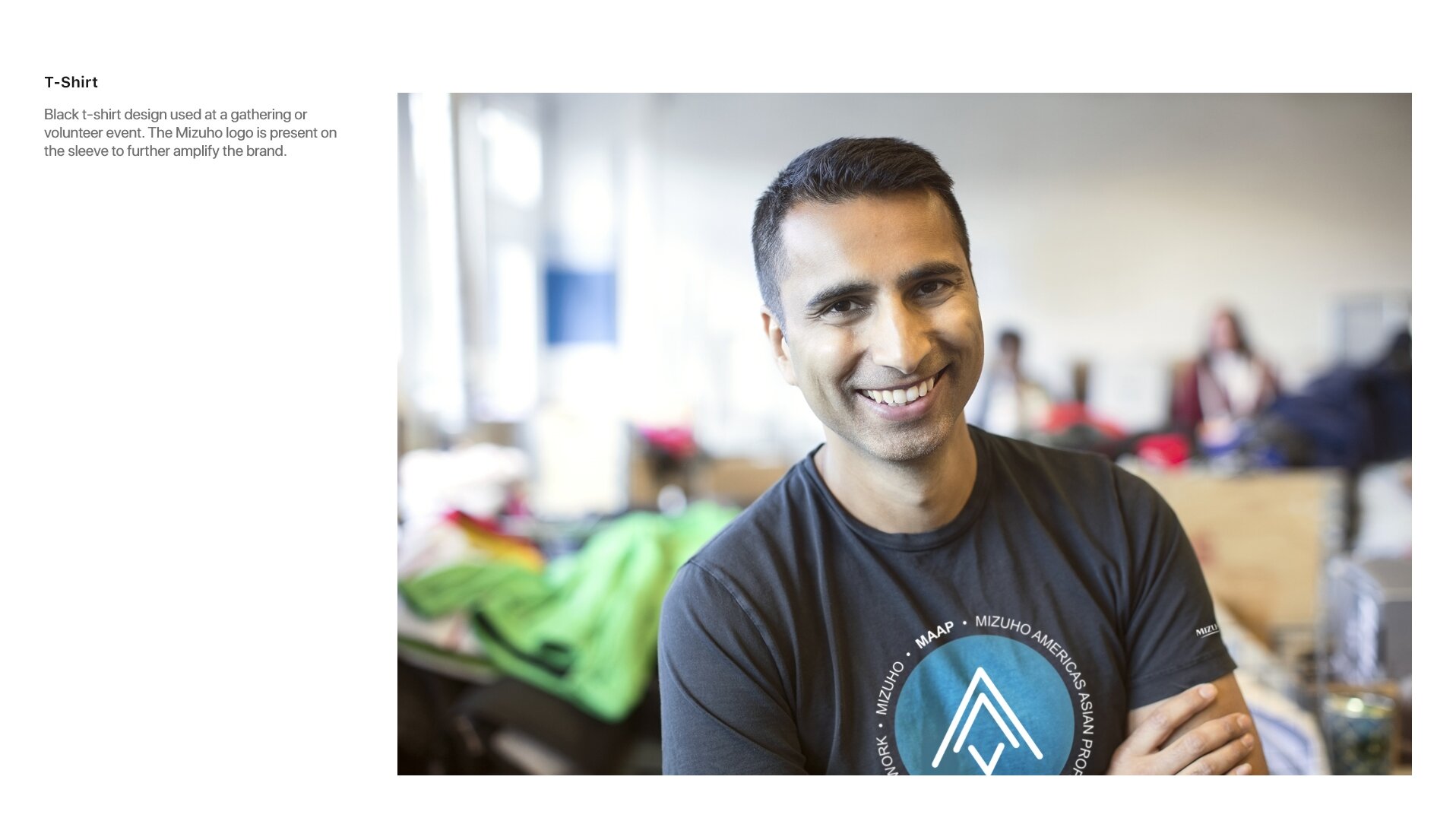
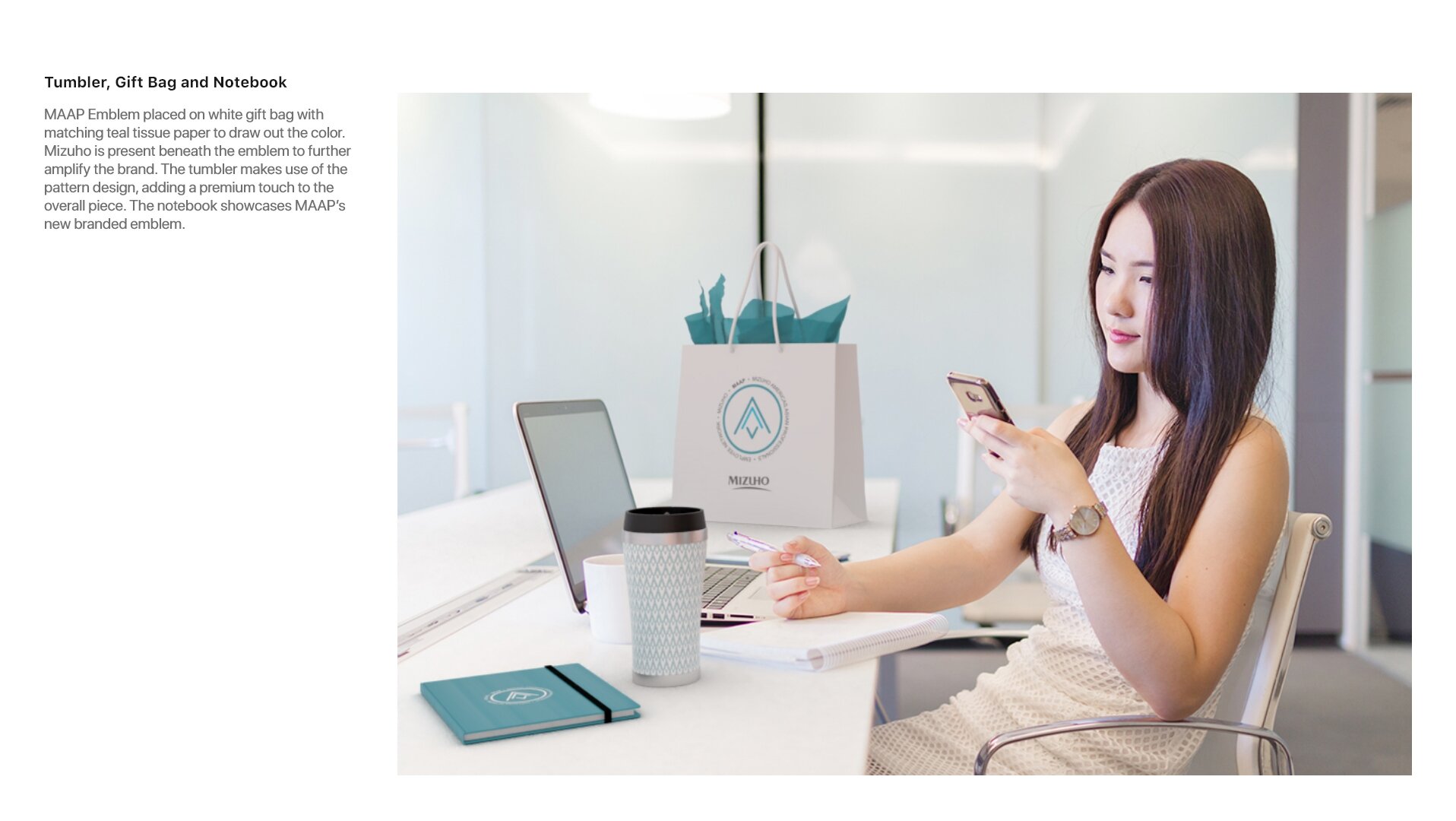
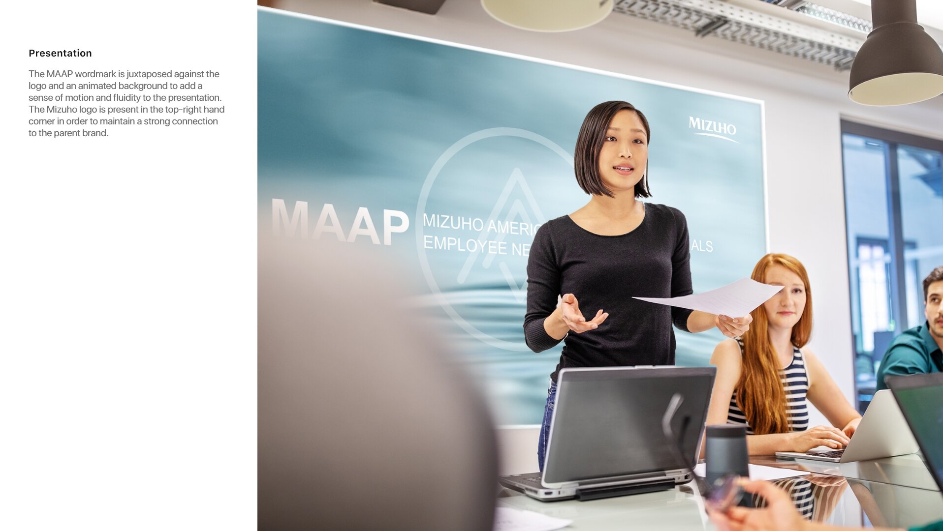
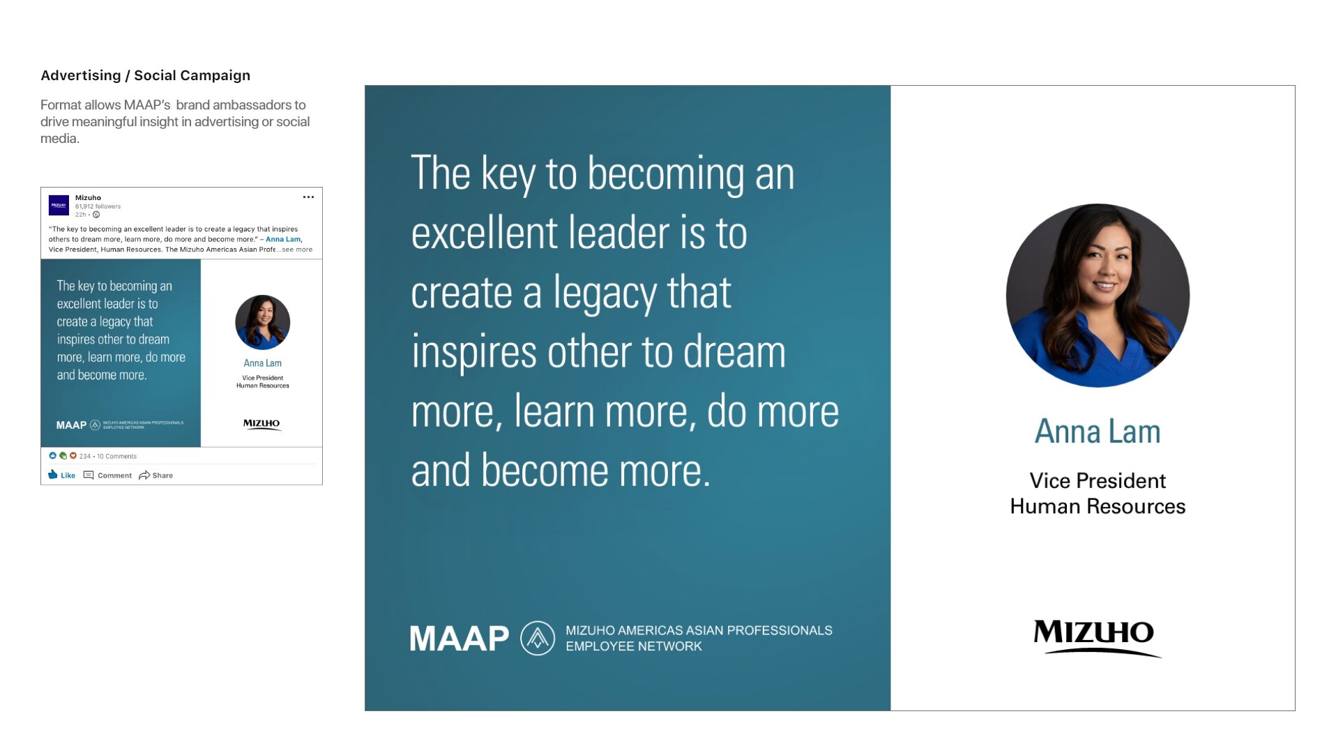
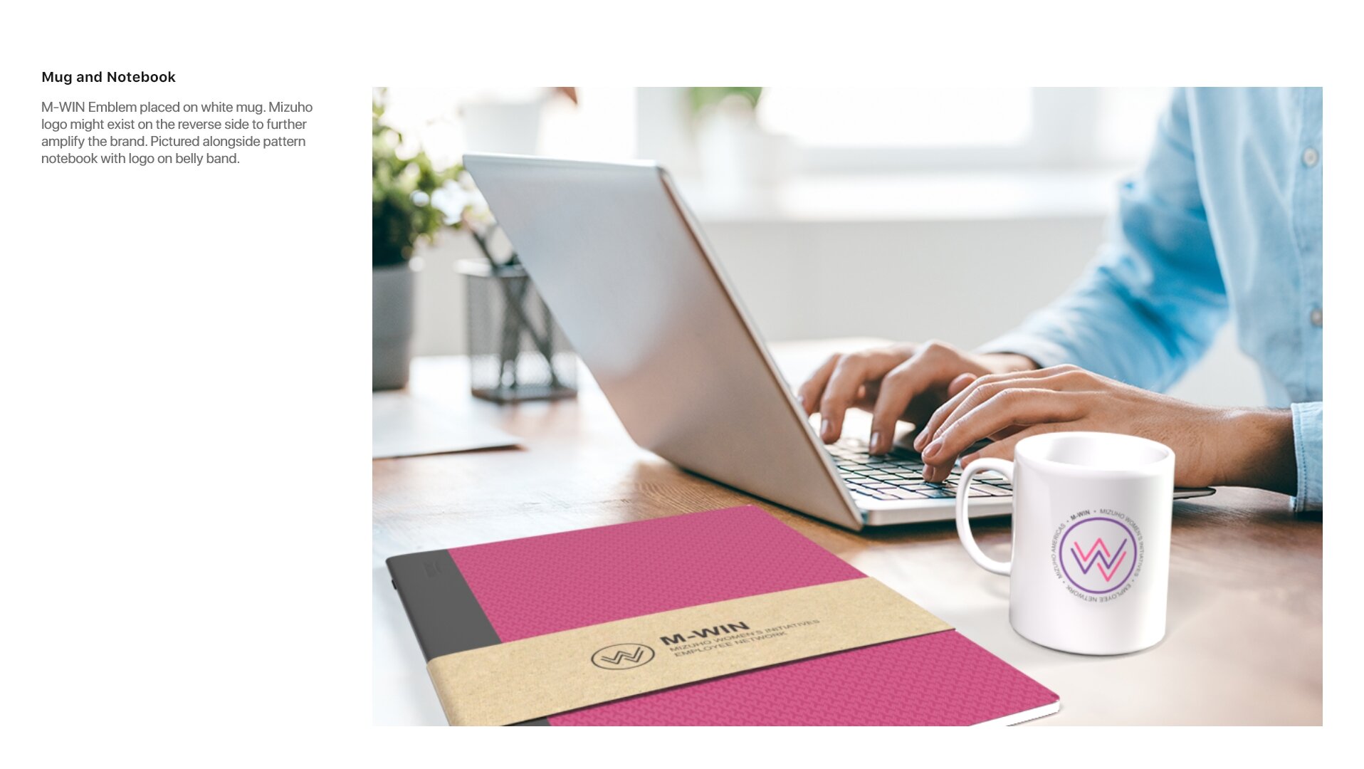
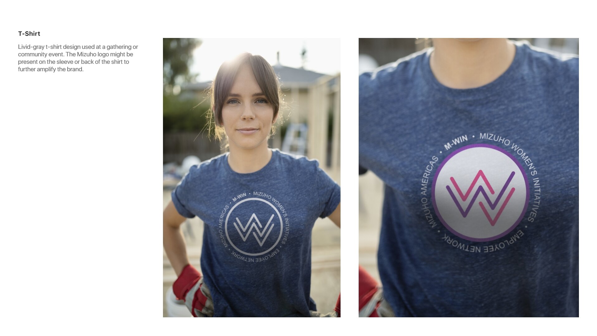
Employee Resource Groups (ERGs) often use logos, badges or emblems to represent their unique affinity and cultural mindset. Well-designed brand marks distinguish groups from other initiatives, provide instant recognition at events, play well on social media, and create branding for promotional items and giveaways.
Mizuho’s visual treatments for ERGs were rudimentary and inconsistent. They were boring to look at, offered no distinction between categories, and complemented the brand poorly. There was a unique opportunity to reconnect with brand objectives by designing identity marks that better reinforced the company’s vision, mission, and values.
My goal was to create a system that offered:
a strong link to the parent brand;
an obvious design language;
a uniform design grid;
a clear naming hierarchy;
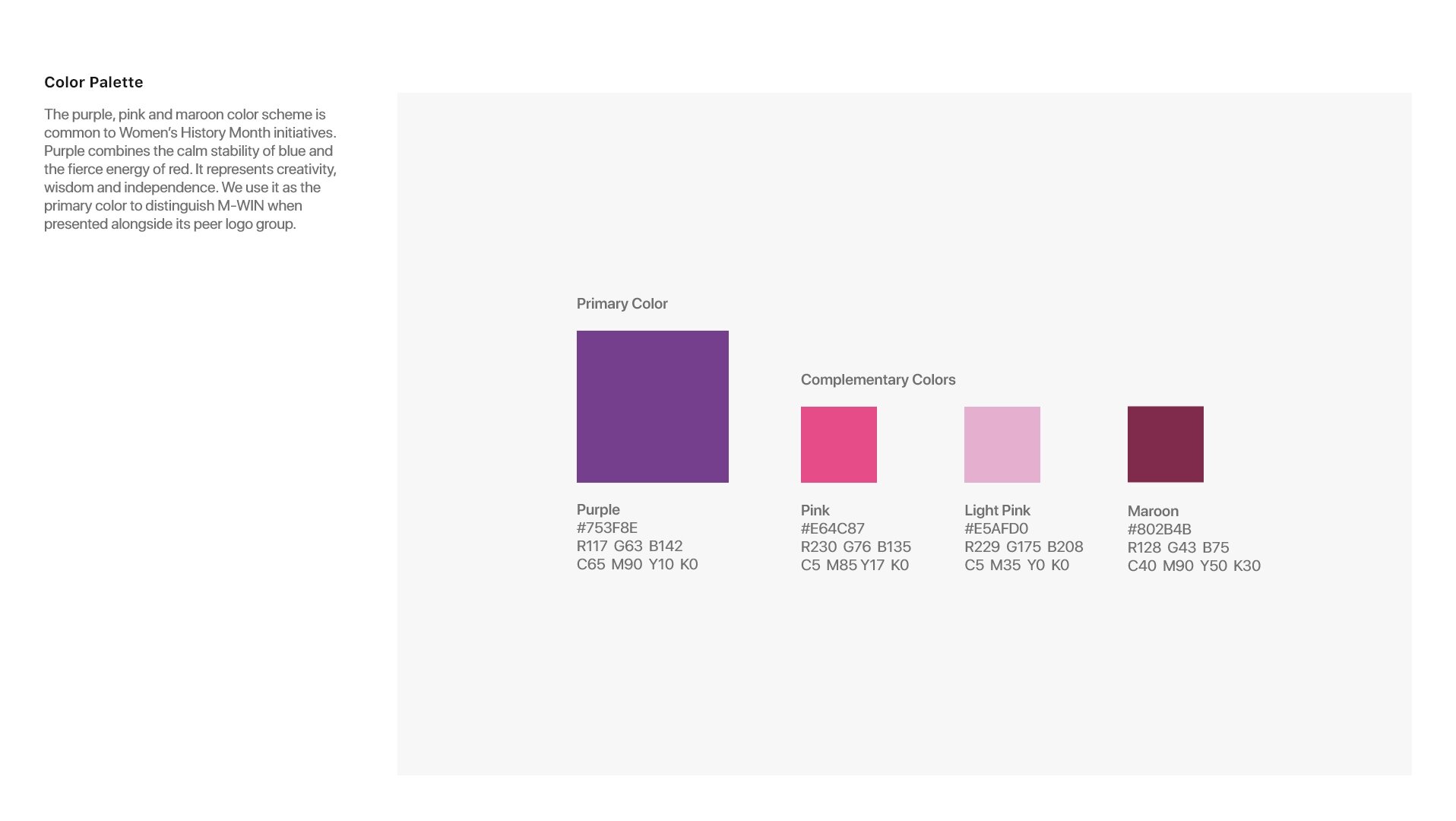
consistent use of type and color;
language customization;
event and social media flexibility;
greater digital awareness;
design creativity.
Design Explorations
Inspiration
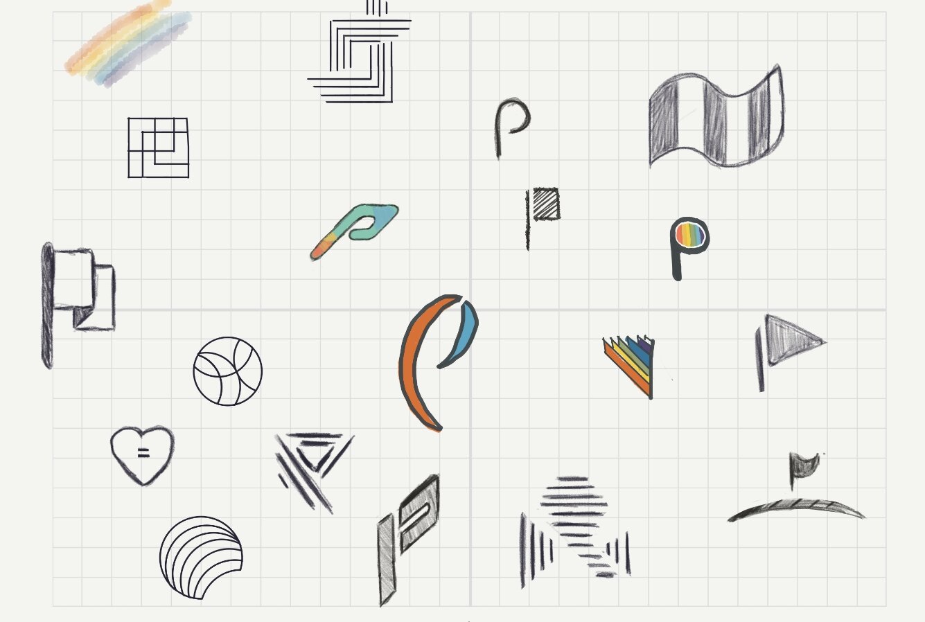
PRIDE: rainbows, hearts, flags, partnership, splashes of paint, pop, flair, love, unity
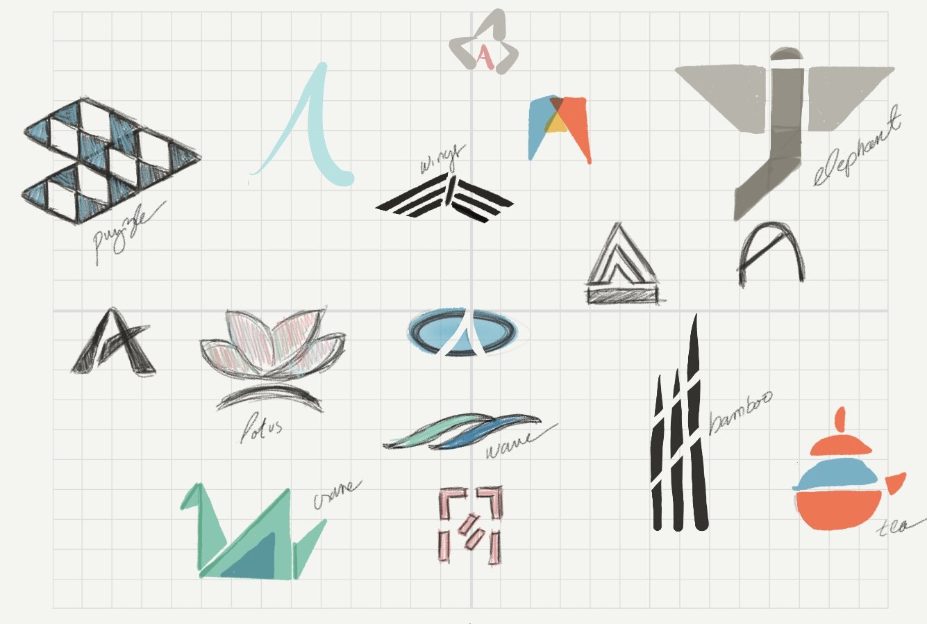
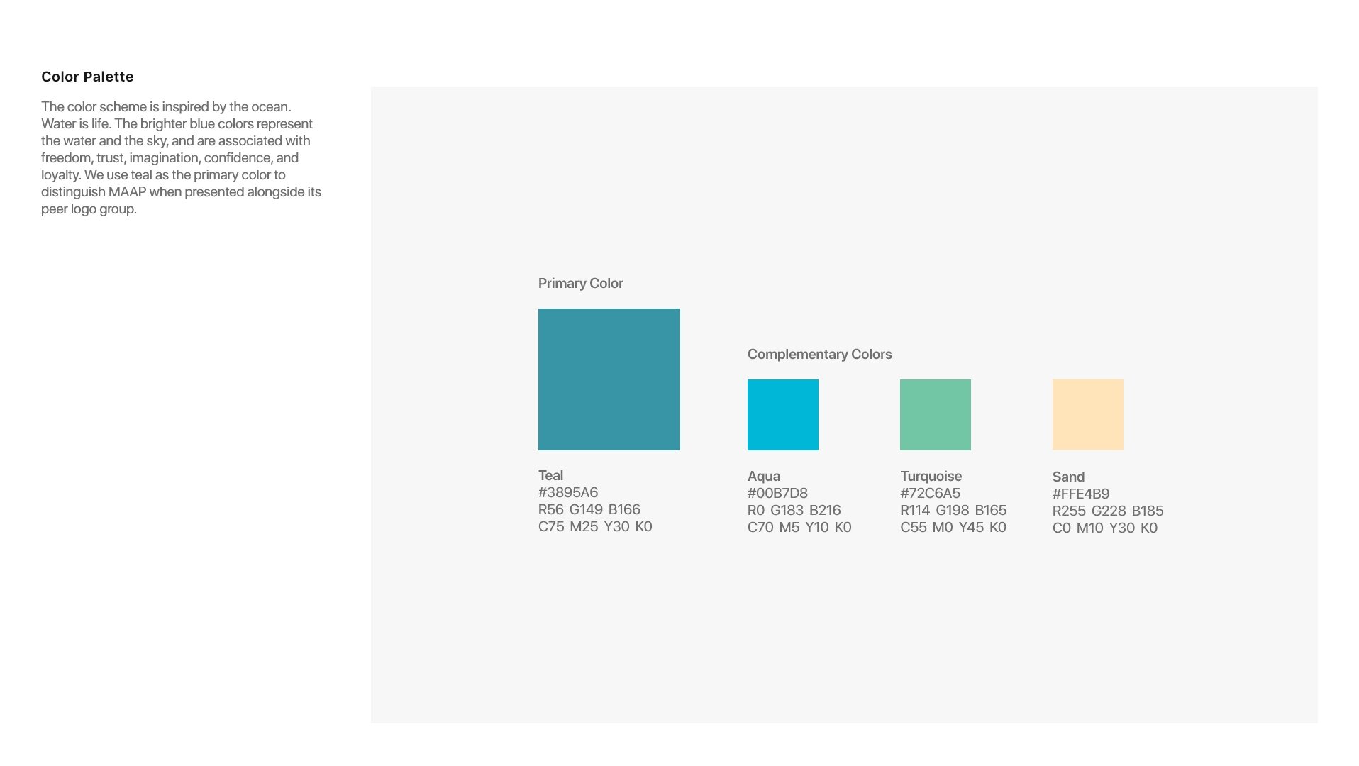
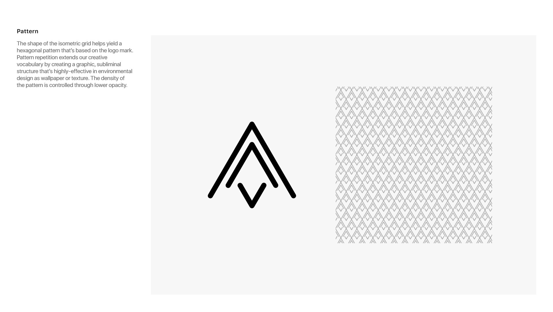
MAAP: pattern, textile, water, waves, lotus, bamboo, nature, organic, aquatic life
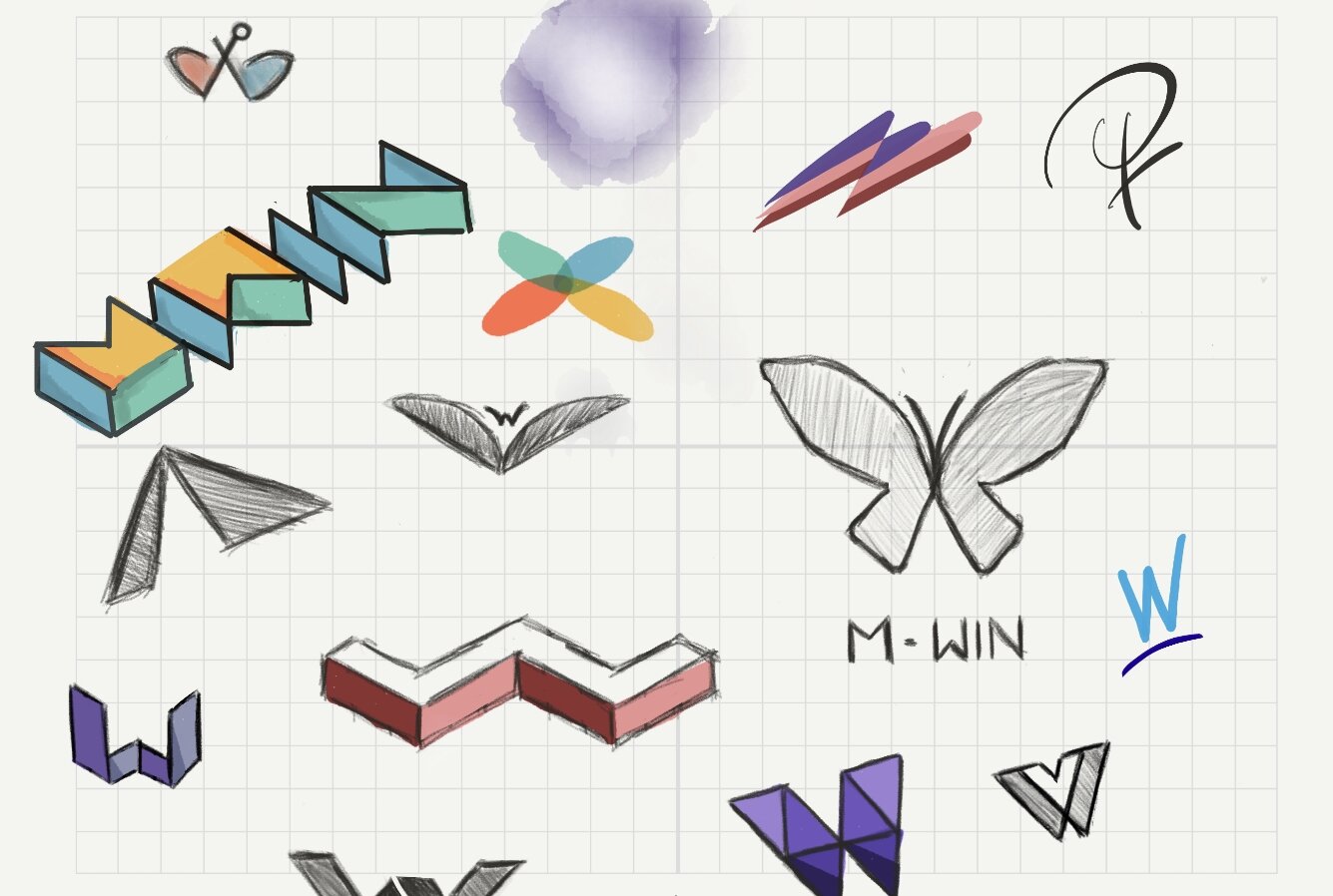
M-WIN: femininity, strength, silhouettes, personas, butterflies, purple, flight
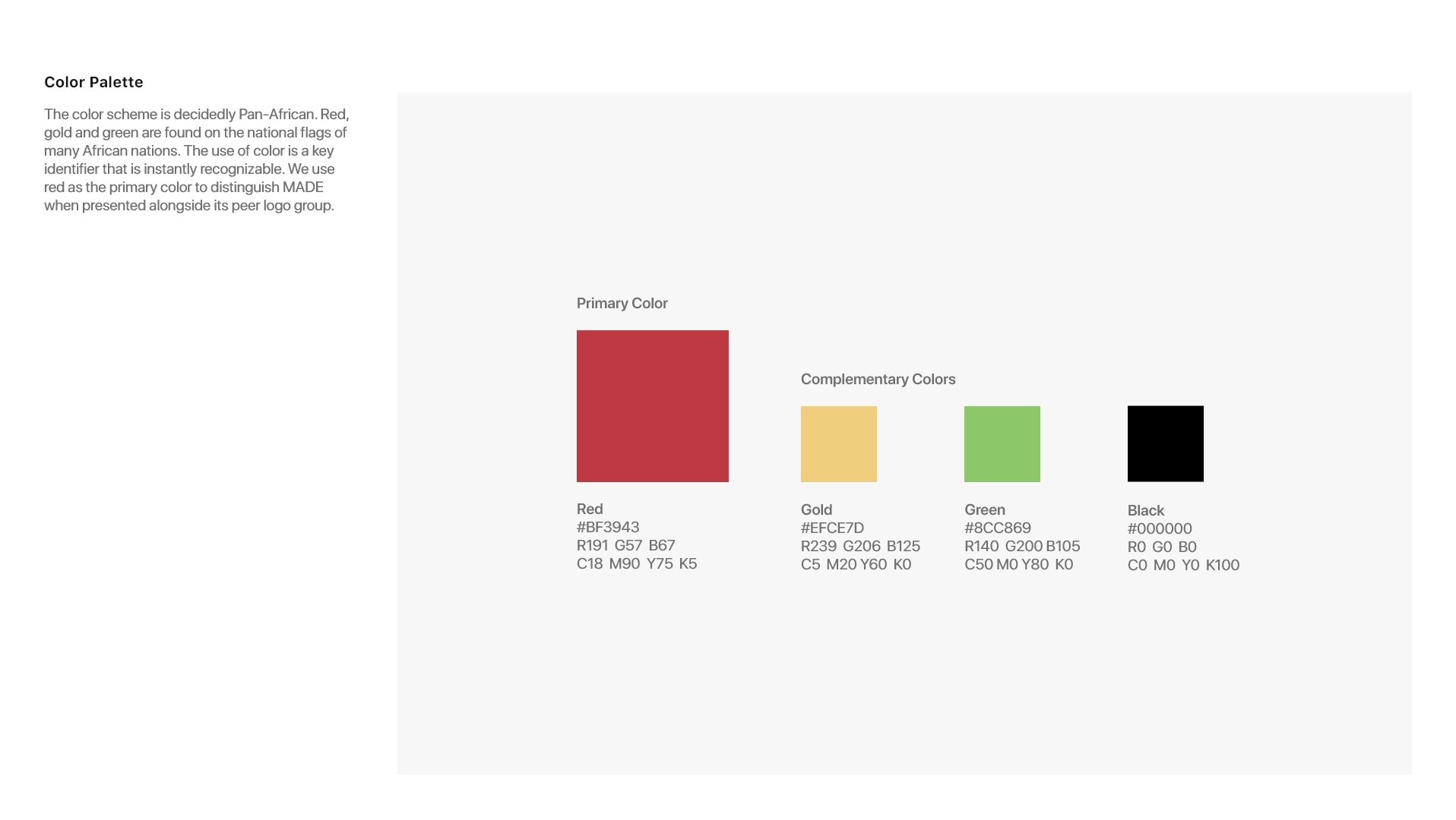
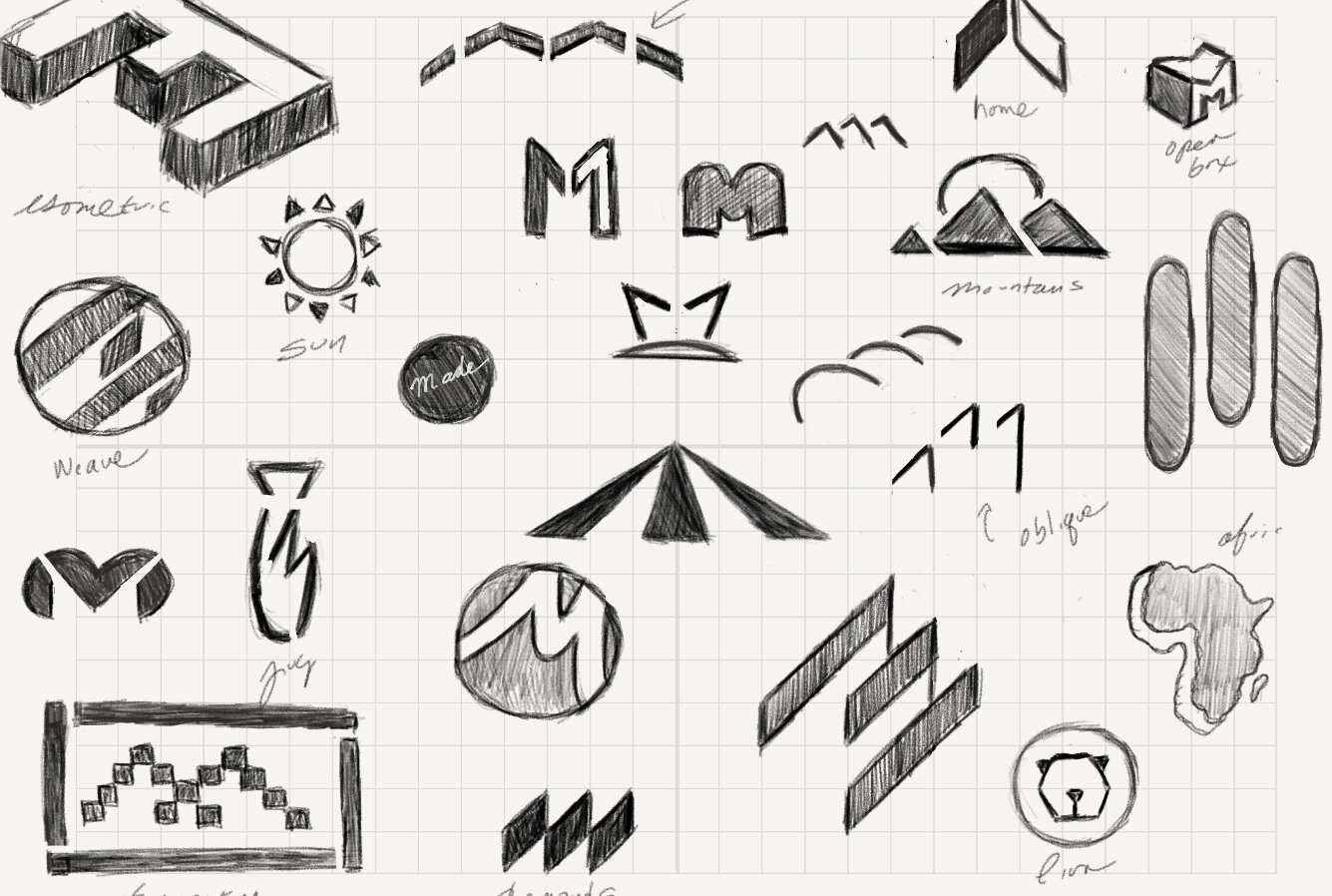
MADE: pan-Africanism, cultural geometry, warmth, origin, heritage, connectivity, earth

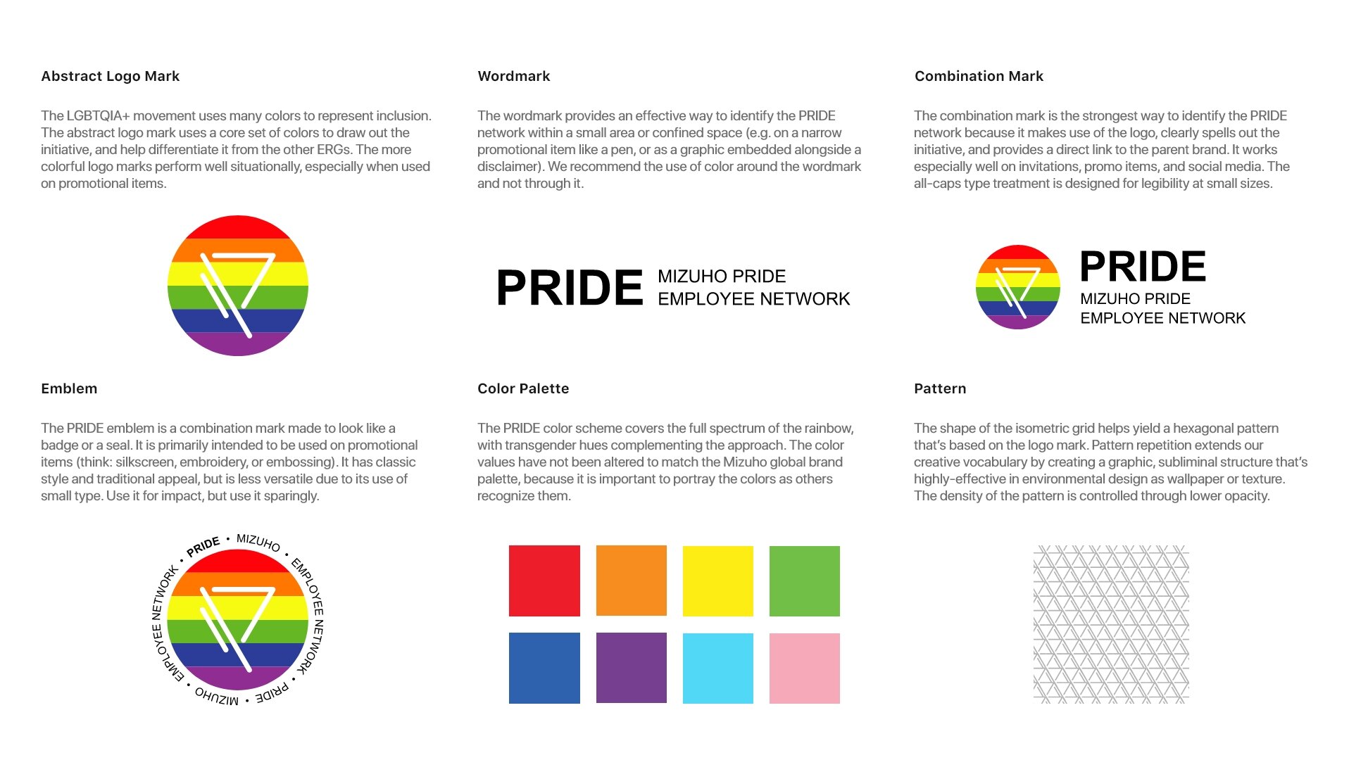
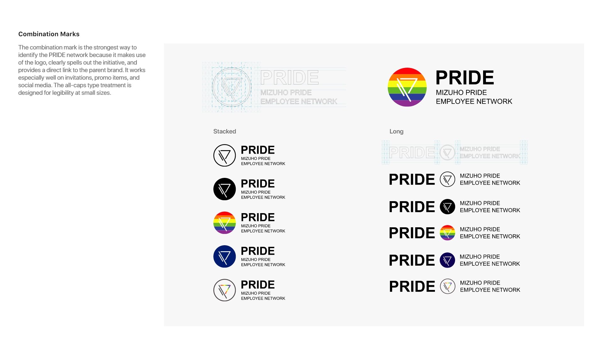
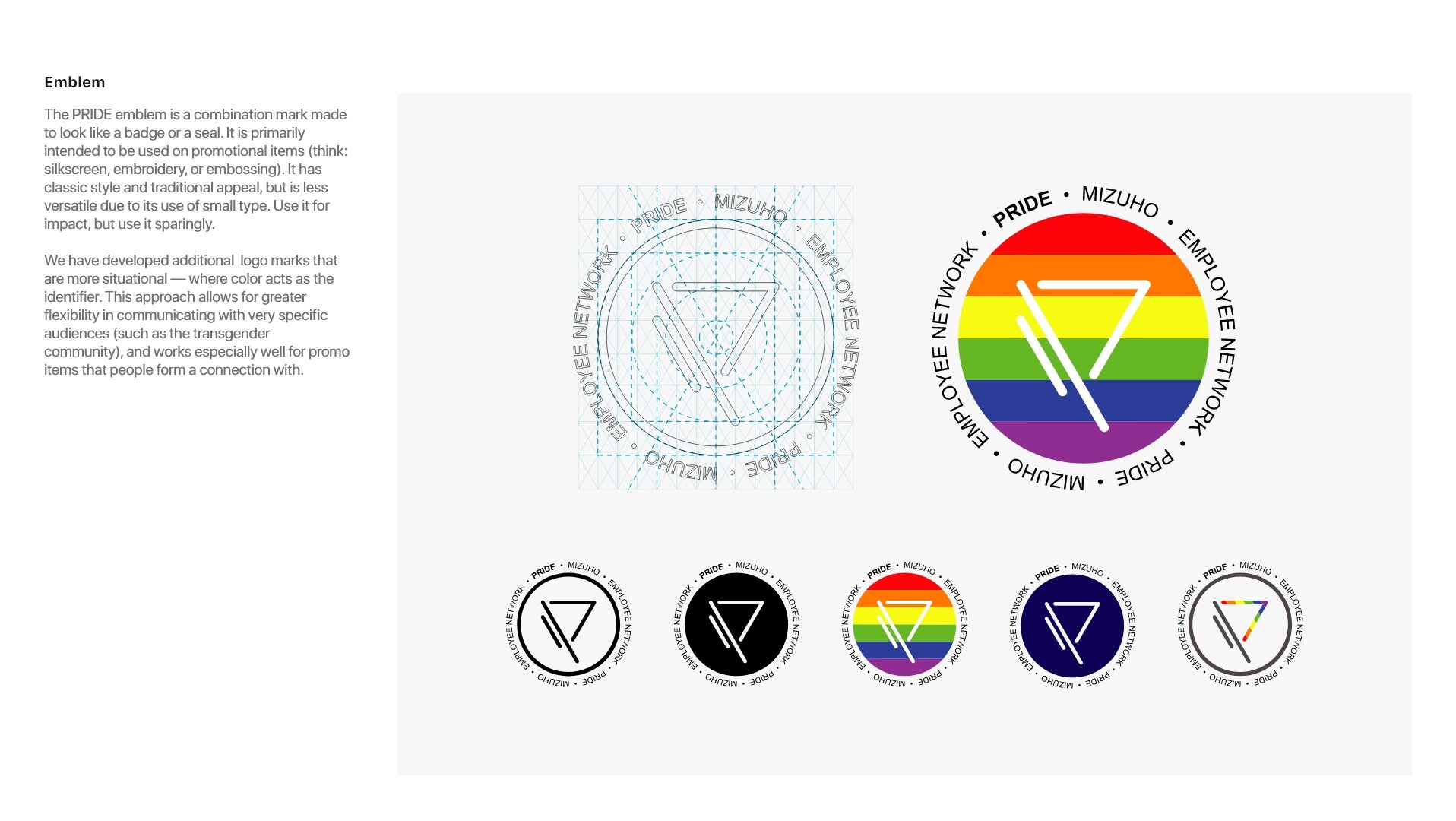
PRIDE
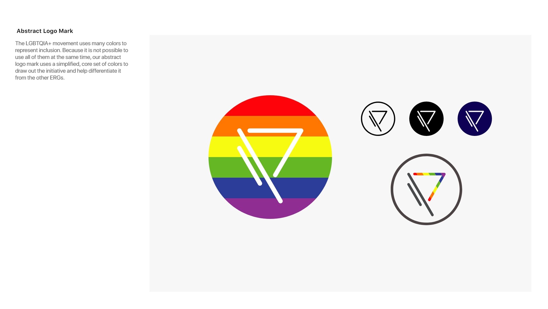
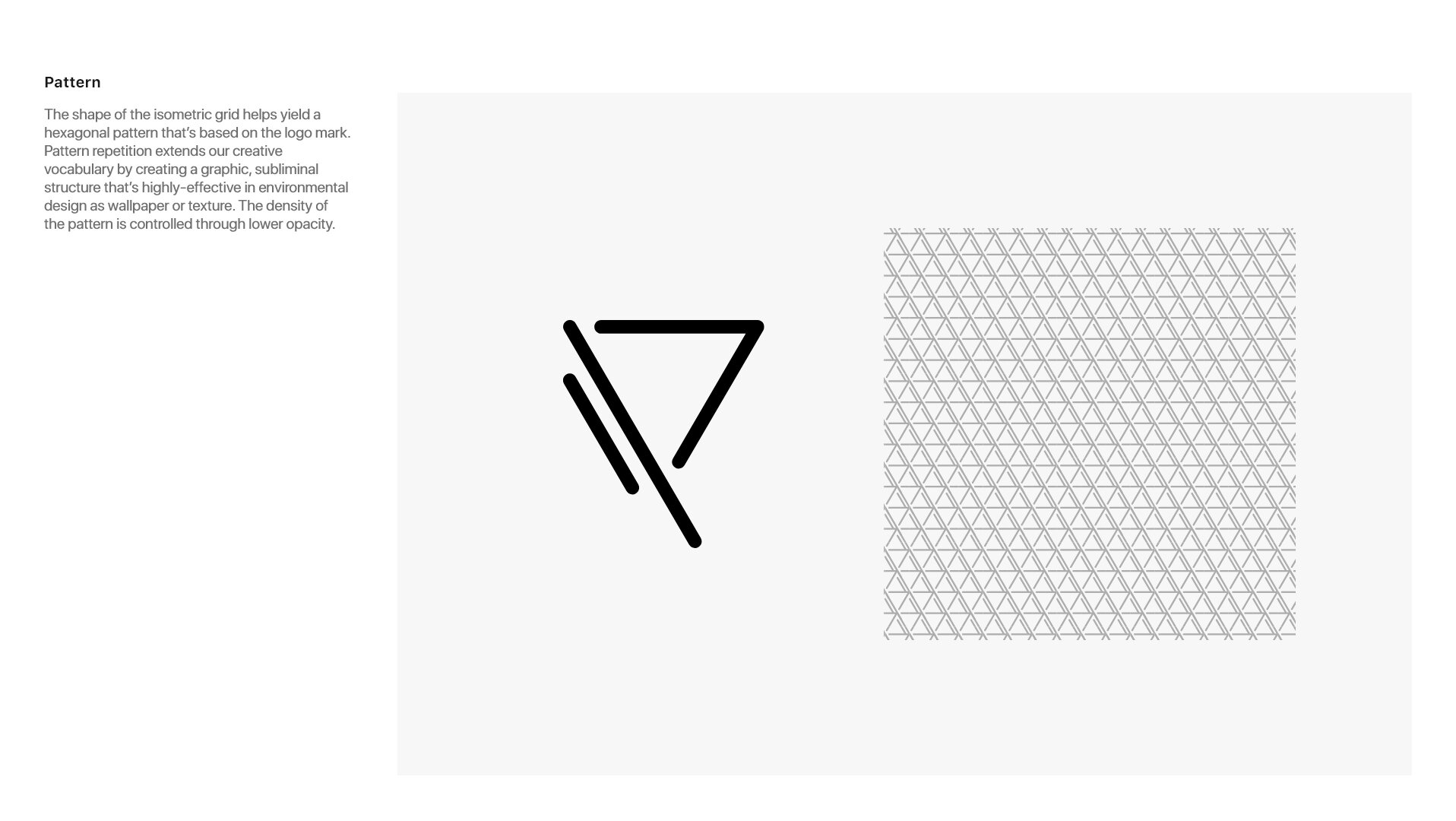
Form of the letter P stand for Pride. Meant to evoke a the shape of a flag. The 3 lines represent spirit, unity and strength; they are also a call back to the 3 banks that came together to form Mizuho. Encapsulated in a circle to convey wholeness. Sharp angles communicate decisiveness, while rounded corners introduce sensibility. Built on a 60º oblique grid to create technical alignment throughout the peer logo group.

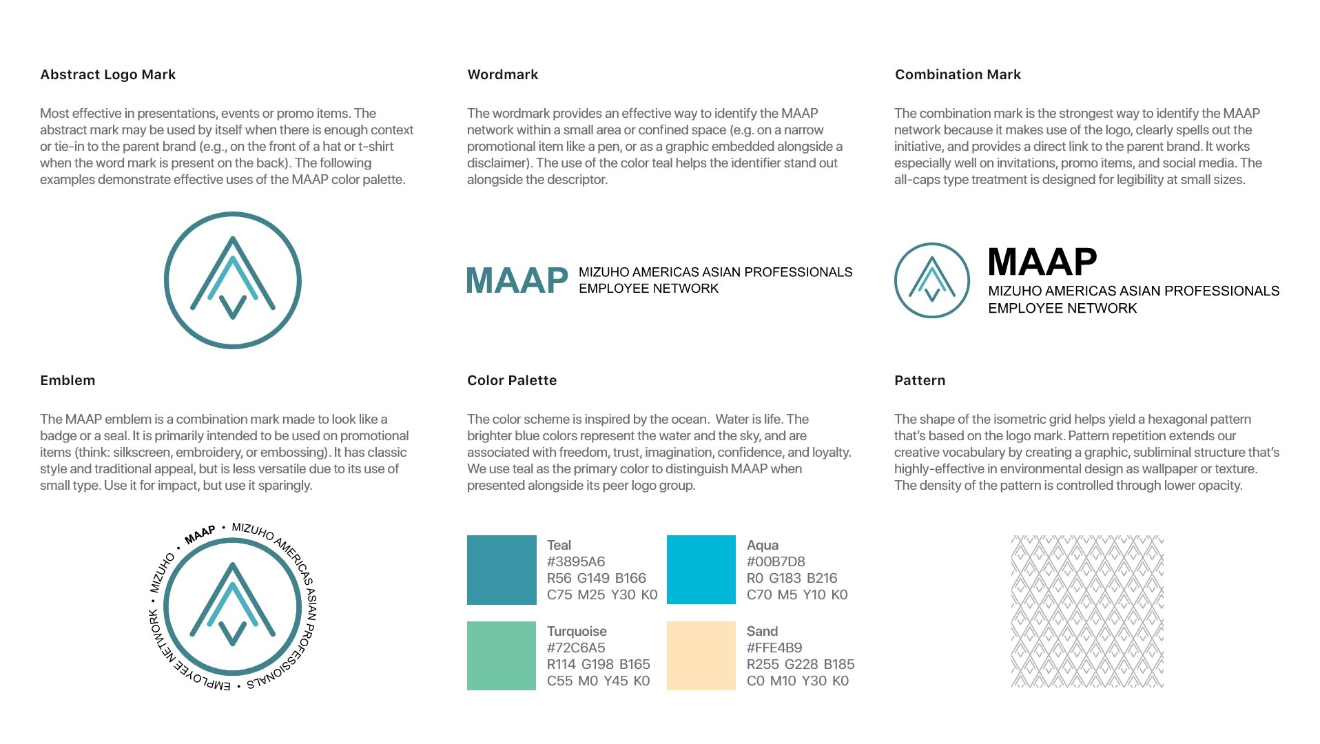
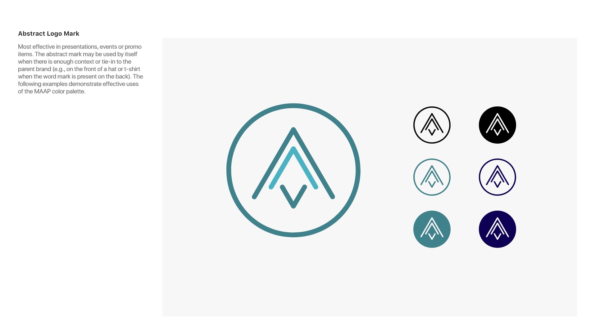
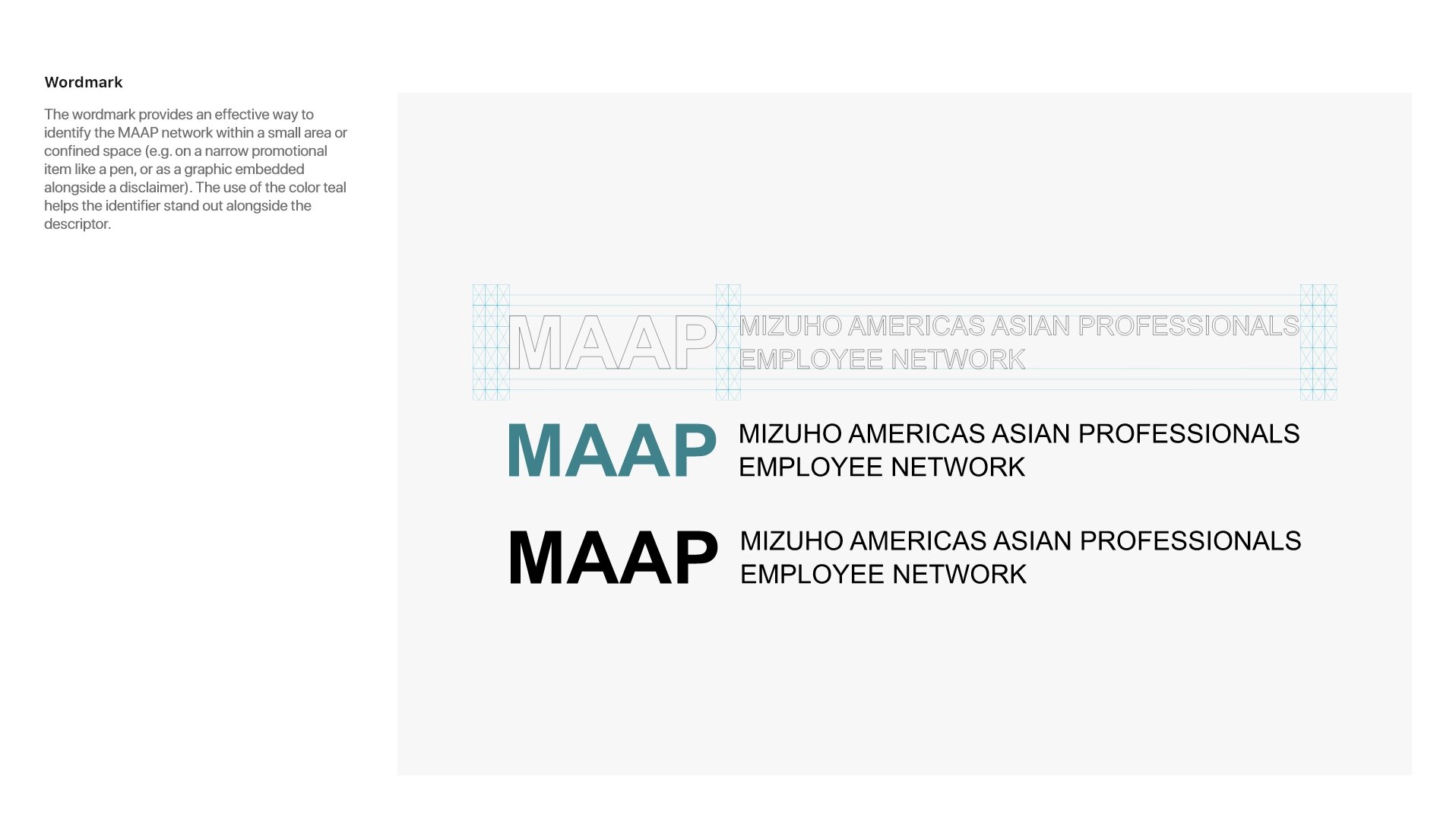
MAAP
Form of the letter A stand for Asian. Meant to evoke a navigational symbol pointing north, or the bow of a ship, staying the course and steering full-speed ahead. The 3 lines represent progress, working together, moving in the same direction; they are also a call back to the 3 banks that came together to form Mizuho. Encapsulated in a circle to convey wholeness Sharp angles communicate decisiveness, while rounded corners introduce sensibility.

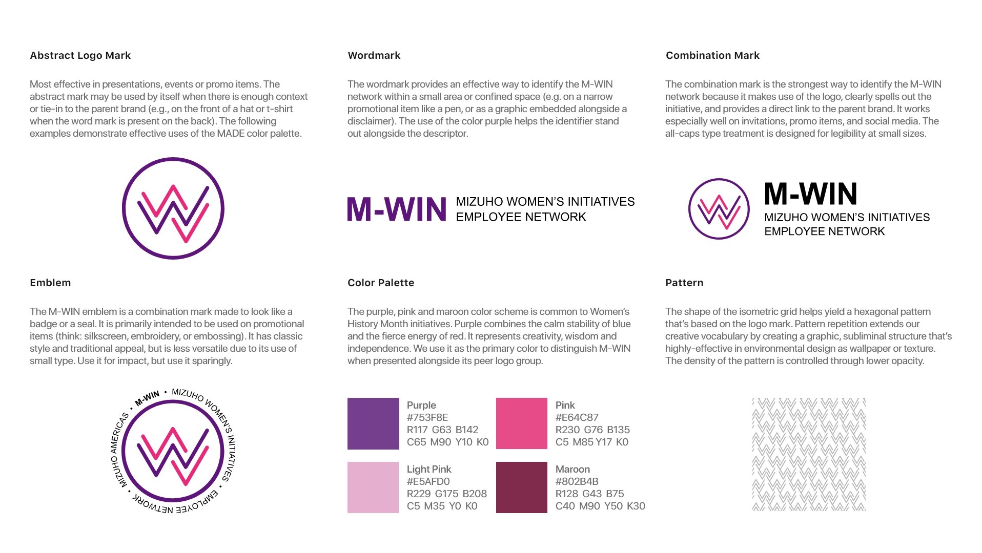
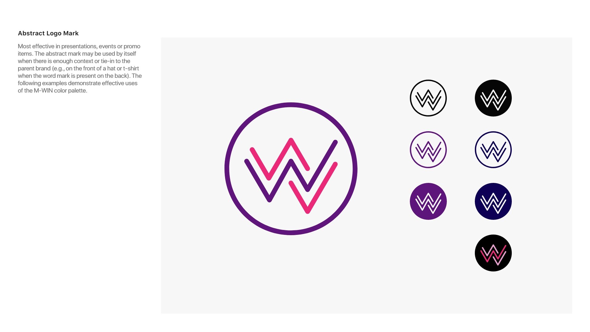
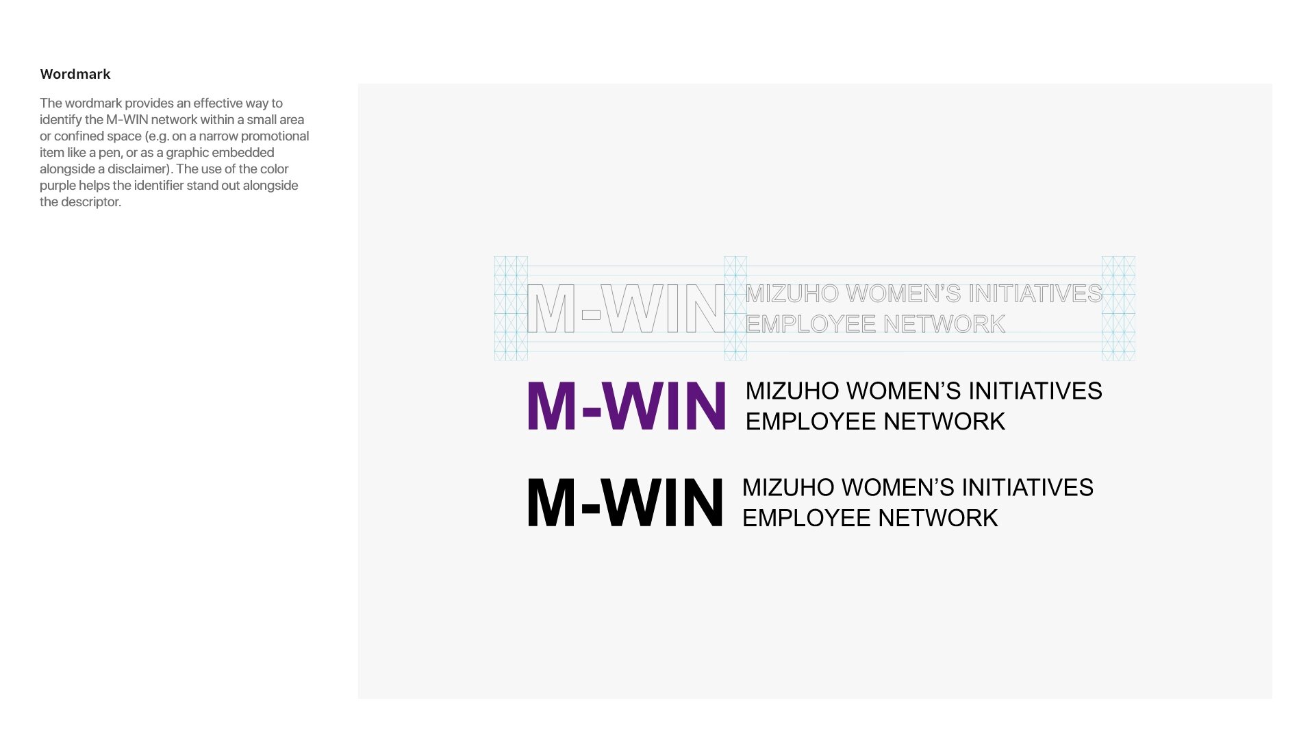
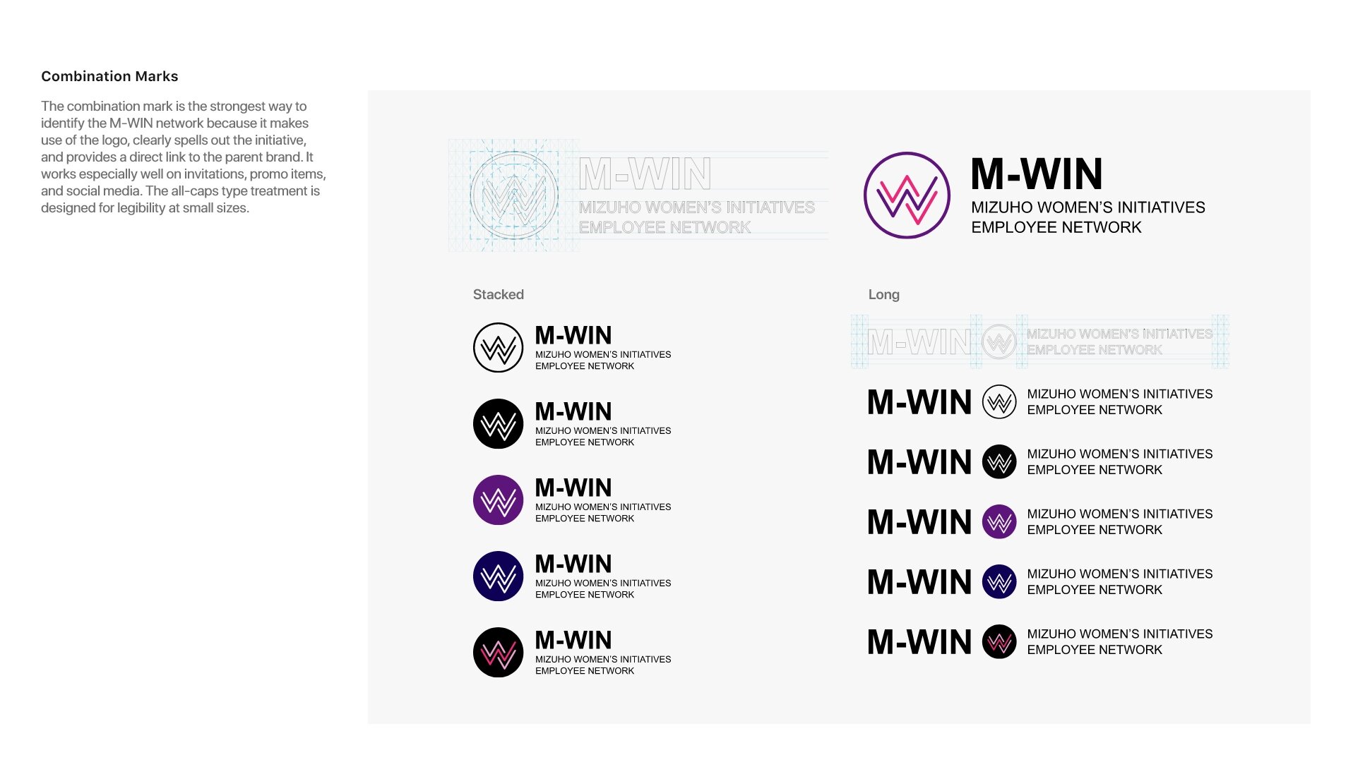
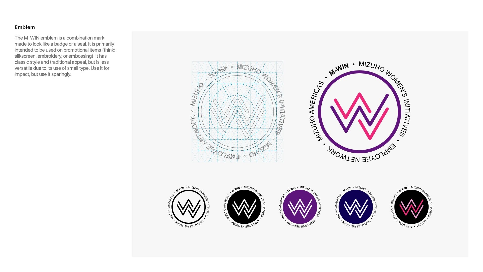
M-WIN
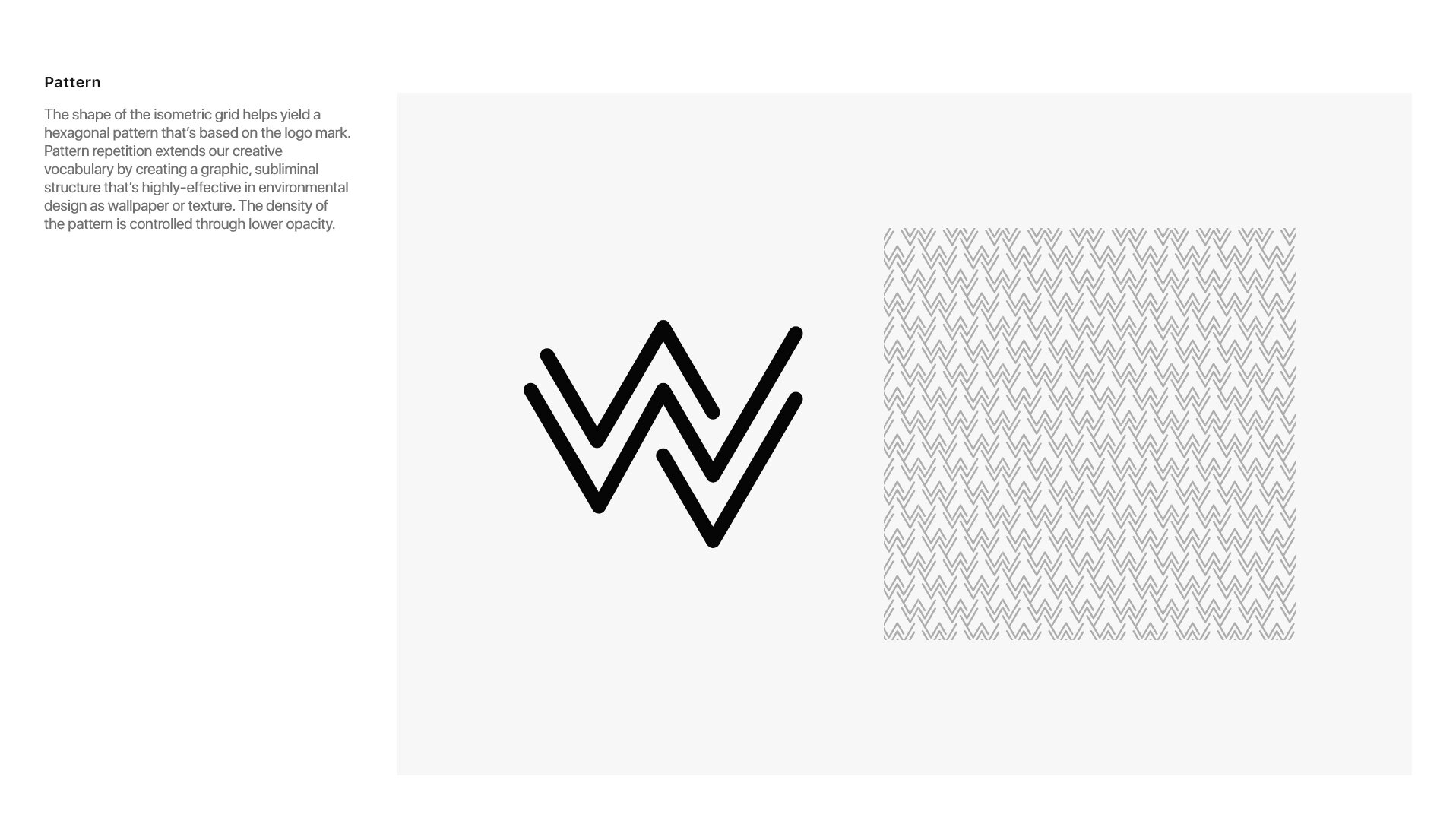
Form of the letter W to stand for Women. Reminiscent of a growth chart to demonstrate acceleration, accomplishment and success. The 3 lines represent amplification, an increase in numbers, synergy and alignment; they are also a call back to the 3 banks that came together to form Mizuho. Encapsulated in a circle to convey wholeness. Sharp angles communicate decisiveness, while rounded corners introduce sensibility.

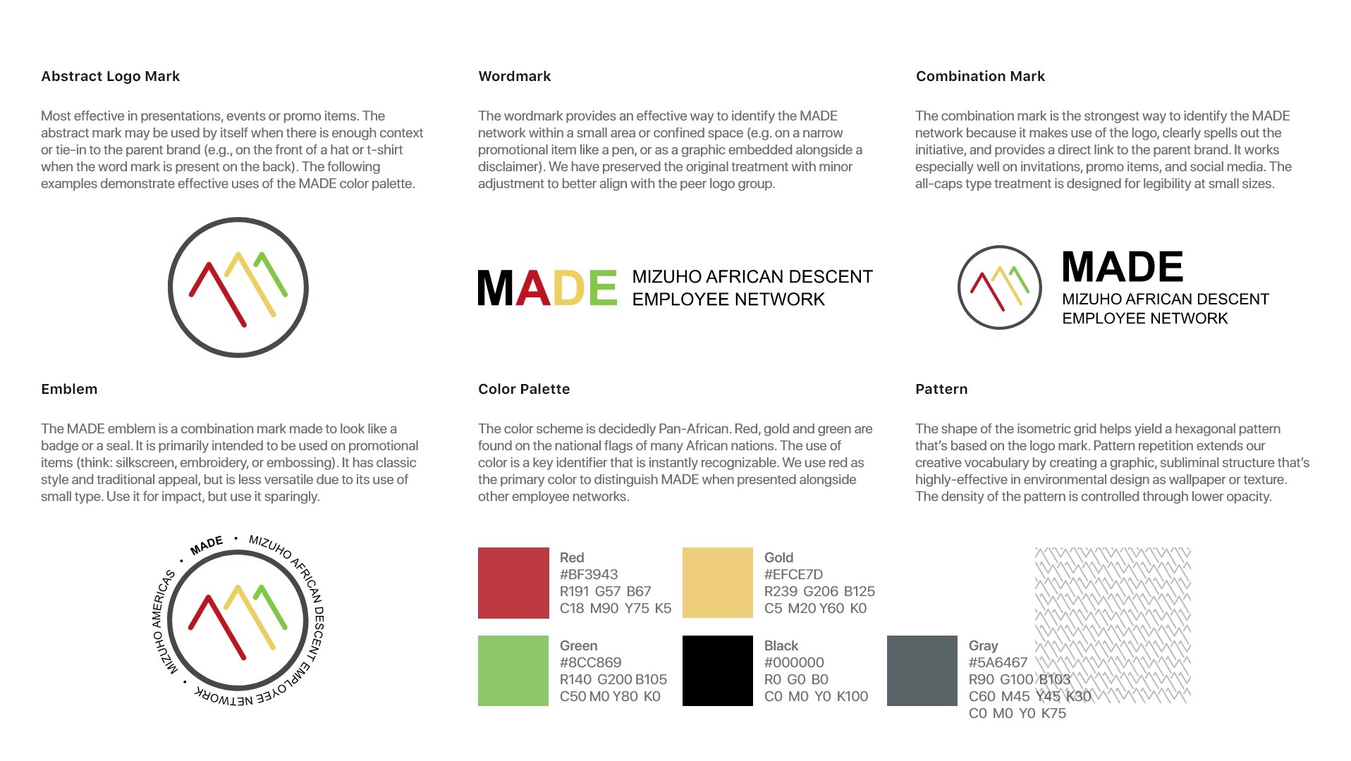
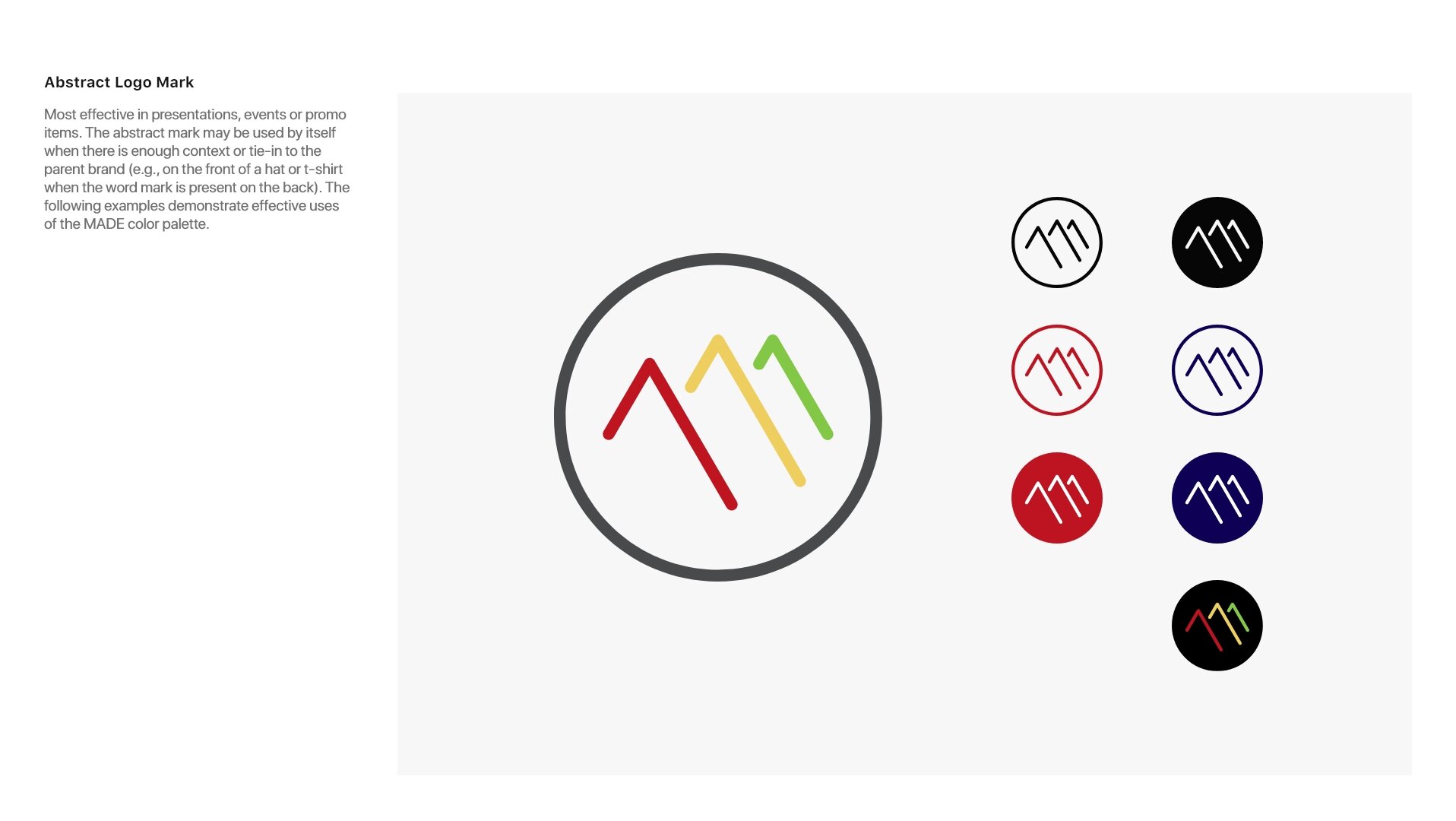
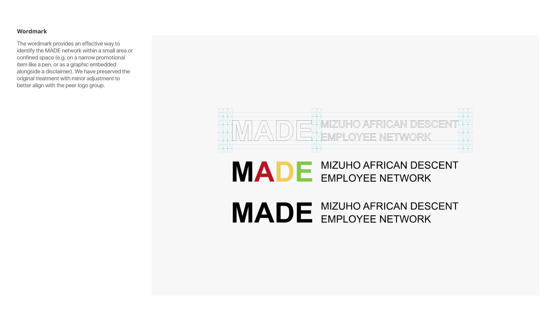
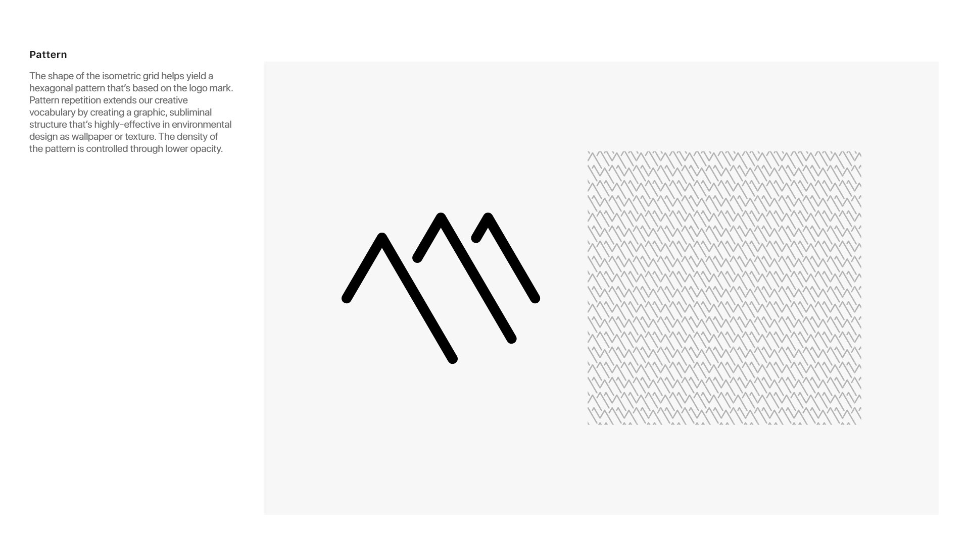
MADE
Form of the letter M to stand for MADE. Shaped like a mountain to represent an ascent, the reaching of an apex, a crowning achievement the pinnacle of success; they are also a call back to the 3 banks that came together to form Mizuho. The 3 lines represent strength in numbers, overcoming obstacles and climbing to the top; evokes the three peaks of Kilimanjaro. Encapsulated in a circle to convey wholeness. Sharp angles communicate decisiveness, while rounded corners introduce sensibility.